Colors can make or break your brand. Yes, its 100% true.
If you feel your brand color is not appropriate or does not really reflect the voice of your business then it’s time for rebranding.
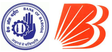
A now well-known bank in India, Bank of Baroda changed their logo and it’s color from blue to orange because earlier the logo was traditional with an industrial and agriculture wheel with Sanskrit letters were inscribed.
They went with new logo in an orange color as they wanted to project that they stand for hope, diversity and energy.
I came across an article that mentioned about a study that found that a product’s color influences 60 to 80% of a customer’s purchasing decision. So why not make use of this creative capability.
Now the question should be, how to choose right color for my brand ?
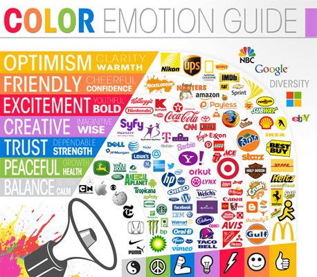
Well, you can read a lot online about color psychology and how it can effects someone’s mood or emotion.
For brands related to medicine we generally use blue because it gives us a feeling of trustworthiness, reliability and calm. In medical field these things matters a lot.
In any playful design yellow and orange is used. Yellow is about happiness that why our WhatsApp emoticons are in yellow color. In children’s book or illustration or classroom you will always find yellow and orange color because it keeps us fresh, creative, adventure, optimistic, playful and happy.
Therefore, every color has a meaning of its own.
Checkout below chart, it will help you to make a decision about your own brand color.
Let’s see some famous Indian brands as examples-
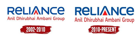
- Reliance
They have used 2 primary colors blue and red.
Blue is used for technology and red signifies freshness, strength, and life.
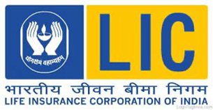
- LIC
The blue and yellow color stands for light, secure, protect and hope.
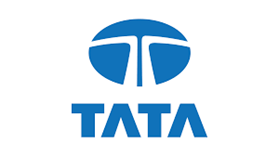
- Tata Group
The logo color symbolizes excellence, reliability, strength, fluidity, and adaptability.
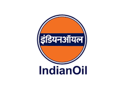
- Indian Oil
The saffron colour represents energy, future and dark blue is for energy.
- Airtel
Red color in the logo makes it feel energetic, and innovative. Interestingly, Vodafone too shares the same color scheme though both are competitors.

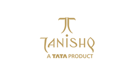
- Tanishq
Golden color used for luxury, wealth, riches, compassion, magic and sophisticated.
Also don’t forget to check your competitor’s brand colors as you need to stand out from the crowd.
There are certain colors that help identify your brand as a part of an industry. However, this is not a rule that needs to be always followed. One of the biggest mistakes a designer tends to make is designing a logo based on what the competition is doing or what the norms are in the market for the brand. In my opinion this approach is however not always necessary. For example, if a brand who has already positioned itself as a small player in the market wants to now be differentiated. The logo colors should be chosen to reflect the company values or vision.
This is again where the mood board and the brand boards play a very vital role. So happy designing….
This is my attempt to allow a constructive flow of knowledge and experience through these blogs so please do leave the comment below if you like it or have any questions.
Also please do share your own experiences with colors used in logo designs. We would love to know about your experiences and point of view.