self_discovery-09

Self Discovery during Lock-down

Back in March 2020, I was a person who did not understand the importance of learning new skills. Very content with what I knew (or i thought I did 🙂 ), I forgot that we are in a very competitive market. To survive and prosper, one needs to always keep learning something new. I used to come up with excuses like- “I do not have time to learn anything new.” This in fact was true but just partly. I was occupied with a lot of work which I did not want to delegate as I thought no one else will do justice to the work and I will lose my existing client or risk my reputation.

When the Covid pandemic started in March 2020 I started getting more and more projects as many businesses started leveraging social platforms and realized that if they want to survive then they have to go online.

This was the first time I decided to put together a team and delegate some work. The first two months were really difficult for me. I needed to train the team and since I had never really led a team like this it was a steep learning curve for me. Managing and leading was time taking job and sometimes it was very frustrating too. Somehow, I and my team prevailed.

Soon I started getting some me time and then thought about learning something new. Being a graphic designer, I had started taking social media marketing projects for my existing clients on their request. It was a need for them and hence it became a need for me. That is when I thought of learning more about social media marketing and took an online course. It was fun and I started enjoying that. Then I took two more projects for social media marketing and kept learning new things everyday about social media as well as marketing.

Learning new skills was so exciting! I started working on a WordPress website for the 1st time for an NGO who also happens to be my client. It was totally free of cost and I considered that website as my contribution to their noble cause. It was a learning project for me and when I completed that project successfully, I felt great sense of pride.

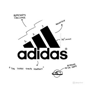
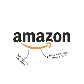
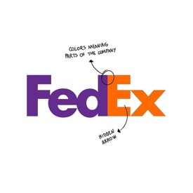
After that I did not look back. I learned about character designing, accounting software, social media marketing, English grammar(Yes, I am really bad at it 😉 ), brand strategy and much more . There’s so much to explore and learn. Now its a habit. Every month I try to learn at least one thing new.

Therefore, if you are the one who runs away from learning a new skill just like me, should give it a try, I am sure you will love it. It gives you confidence and a direction to move forward. The benefits you reap out of learning will soon seem like a by-product. The process itself will excite you more than the outcome.

Happy Learning… 🙂

funny-pics-26.01.2011-08

Can Colors affect your Brand Identity?

Colors can make or break your brand. Yes, its 100% true.
If you feel your brand color is not appropriate or does not really reflect the voice of your business then it’s time for rebranding.

A now well-known bank in India, Bank of Baroda changed their logo and it’s color from blue to orange because earlier the logo was traditional with an industrial and agriculture wheel with Sanskrit letters were inscribed.
They went with new logo in an orange color as they wanted to project that they stand for hope, diversity and energy.

I came across an article that mentioned about a study that found that a product’s color influences 60 to 80% of a customer’s purchasing decision. So why not make use of this creative capability.

Now the question should be, how to choose right color for my brand ?
Well, you can read a lot online about color psychology and how it can effects someone’s mood or emotion.
For brands related to medicine we generally use blue because it gives us a feeling of trustworthiness, reliability and calm. In medical field these things matters a lot.
In any playful design yellow and orange is used. Yellow is about happiness that why our WhatsApp emoticons are in yellow color. In children’s book or illustration or classroom you will always find yellow and orange color because it keeps us fresh, creative, adventure, optimistic, playful and happy.
Therefore, every color has a meaning of its own.

Checkout below chart, it will help you to make a decision about your own brand color.


Let’s see some famous Indian brands as examples-

  • Reliance
    They have used 2 primary colors blue and red.
    Blue is used for technology and red signifies freshness, strength, and life.
  • LIC
    The blue and yellow color stands for light, secure, protect and hope.
  • Tata Group
    The logo color symbolizes excellence, reliability, strength, fluidity, and adaptability.
  • Indian Oil
    The saffron colour represents energy, future and dark blue is for energy.
  • Airtel
    Red color in the logo makes it feel energetic, and innovative. Interestingly, Vodafone too shares the same color scheme though both are competitors.
  • Tanishq
     Golden color used for luxury, wealth, riches, compassion, magic and sophisticated.

Also don’t forget to check your competitor’s brand colors as you need to stand out from the crowd.

There are certain colors that help identify your brand as a part of an industry. However, this is not a rule that needs to be always followed. One of the biggest mistakes a designer tends to make is designing a logo based on what the competition is doing or what the norms are in the market for the brand. In my opinion this approach is however not always necessary. For example, if a brand who has already positioned itself as a small player in the market wants to now be differentiated. The logo colors should be chosen to reflect the company values or vision.

This is again where the mood board and the brand boards play a very vital role. So happy designing….

This is my attempt to allow a constructive flow of knowledge and experience through these blogs so please do leave the comment below if you like it or have any questions.

Also please do share your own experiences with colors used in logo designs. We would love to know about your experiences and point of view.